Wayfinding signs for a driveway and car park
- Wayfinding signs for indoor or outdoor use
- wayfinding for parking, directions, restricted areas
- sign writing for any type of wayfinding signage
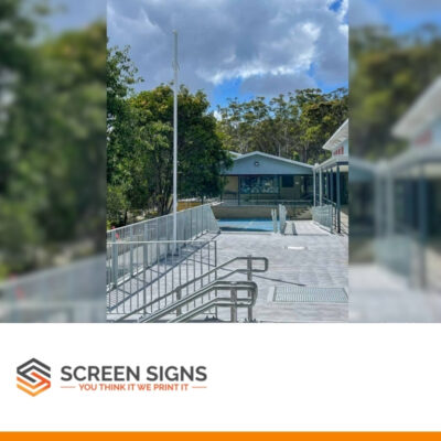
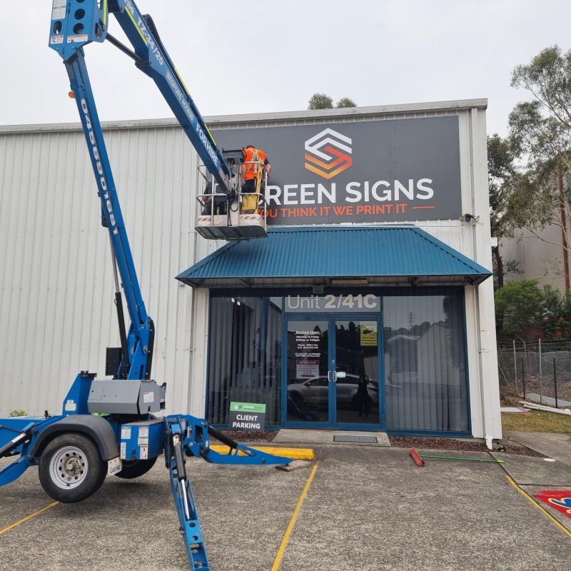
John Hunter Hospital needed a sign writing company in Newcastle like Screen Signs to design, print and install new wayfinding signs in their car park area and driveway that included new poles as well as new signage. They wanted to control the flow of traffic that was using the driveway entry and ensure that both staff and visitors knew which direction was the correct way to enter and exit. This is a very typical example of the signage for buildings, property or retail shops that we can design, print and install in in Cardiff and the broader Newcastle area of NSW.
Like many things these days we don’t notice signs until you feel lost right? Wayfinding signage design plays a vital role in making places easy to navigate and recognise. It’s a specialised field of sign writing design that uses pictograms, maps, graphics and language to help people find their way. Lots of these symbols and terminology are universal; others reflect the language, culture and iconography of local communities.
We can create systems made up of dozens of sign types, from pedestrian or vehicular signage to identification signage and directories. We can design building signage or statutory signage, which is required by law to comply with health and safety legislations.
Wayfinding signage for a car park
For any large commercial, industrial, warehouse or retail site there are a number of different compulsory & optional regulations that each site manager needs to manage. For a car park most of the way finding signage that needs to be installed is crucial for helping people navigate their way around and managing the flow of vehicles and pedestrians.
Sometimes wayfinding signage will be used together with things like pedestrian fencing, safety barriers, boom gates and other safety devices to control the flow of people and cars. For this site, John Hunter Hospital needed parking lot signs because there was an ongoing issue with staff using the ‘In’ gate to exit the car park instead of the correct ‘Out’ driveway.
So we provided an installation service for the sign post to be installed in the ground, printing / installation of the way finding signs as well as way finding signs placed on the parking gate station with suitable brackets. This meant there was a very clearly visible ‘No Exit’ message provided to any motorist in their vehicle.
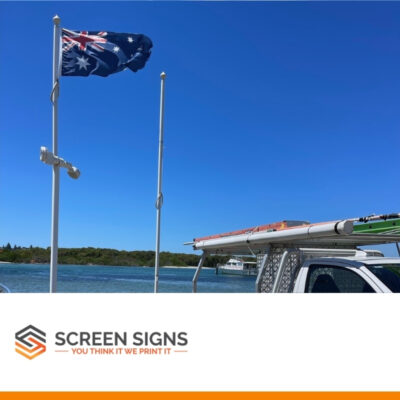
The scope of work included setting out a place for the new steel post itself, digging 600mm deep into the ground, concreting the steel pole in and then letting it sit for a day and returning to install the two “NO EXIT” sign panels onto the existing structure and the new post. We actually had to dig through a lot of rock to insert the pole vs most locations that are just soil and/or dirt.
So to get this new way finding signage installed took about 5 hours all up with two separate visits.
What is wayfinding signage?
In your business operations, wayfinding signage is the quiet maestro conducting a seamless experience for your visitors and staff. It’s the unsung hero that guides, informs, and comforts, ensuring that everyone finds their destination without a hitch. So, what exactly is way finding signage, and how can a skilled sign writer compose the perfect visual cues for your specific location, be it an office, shop, or sprawling business complex?
What is Wayfinding Signage?
Wayfinding signage is a system of visual cues that guide people through a physical environment and enhance their understanding and experience of the space. It’s more than just signs; it’s an intuitive map that interconnects the space, guiding your visitors through a clear, easy-to-navigate path. These signs serve various functions, from the practical—directing someone to the nearest exit or restroom—to the brand-centric, infusing your company’s personality into every nook and cranny.
The Composition of Wayfinding
Think of a sign writer as an artisan of orientation, crafting the perfect blend of form and function. Here’s how they tailor the signage to your unique environment:
- Consultation: It starts with a melody of questions. A sign writer will seek to understand your space, your brand, and your needs. They’ll consider the flow of traffic, key destinations within your space, and the mood you want to set. Like a maestro understanding their orchestra, they’ll tune into your business.
- Design: With the notes gathered, they’ll create a design that sings in harmony with your brand’s identity. Whether it’s sleek and modern, warm and rustic, or bold and innovative, the design will reflect the essence of your business. In some cases it will simply be to communicate common directional or safety messages in accordance with standard practices.
- Strategic Placement: Placement is to signage what timing is to music—essential. Your sign writer will identify strategic locations for each sign to ensure maximum visibility and utility, guiding your audience with ease.
- Material and Typography: From durable materials for outdoor signs to elegant finishes for executive suites, they’ll select the right instruments to deliver durability, readability, and aesthetic appeal. The typography, colour, and size will all be orchestrated to ensure clarity and brand cohesion.
- Regulatory: Compliance with ADA and other regulations is not just legal; it’s ethical. Your sign writer will ensure that the signage hits all the right points when it comes to accessibility, so that no one is left confused.
- Installation: The crescendo of the process is the installation. Each sign will be placed with precision, ensuring that the flow is intuitive and that the signs are as functional as they are beautiful.
Getting wayfinding signs printed
A sign writer doesn’t just create signs; they curate experiences. Here’s how you can work with one to enhance your space:
- Share Your Vision: Give them the score of your brand’s symphony—your colors, logos, and the mood you want to evoke.
- Understand the Space: Walk them through your space, pointing out key areas and any potential challenges.
- Trust Their Expertise: Like trusting a violinist to play their part, trust your sign writer’s experience in design and placement.
- Feedback and Fine-Tuning: Provide feedback on the drafts and designs, ensuring the final product is a perfect harmony of your vision and their expertise.
- Regulatory Encore: Always double-check that your signage is in line with local laws and regulations.
Wayfinding signage is a vital part of the customer experience, as integral as a maestro to a performance. With a sign writer’s expertise, you can ensure that every visitor’s journey through your business is smooth, satisfying, and in perfect tune with your brand’s narrative. Think of it as the silent concierge, always at service, ensuring that the only thing your guests need to worry about is how soon they can come back.
Remember, the best wayfinding signage is the kind that goes unnoticed because it’s so seamlessly integrated into the overall experience—a silent guide in the bustling world of your business.
Wayfinding signage costs
Costs
The cost for this type of way finding signage to be installed in a car park will vary between $500 and $3,000 depending on how many signs are needed, the material and how they are to be installed.
Materials
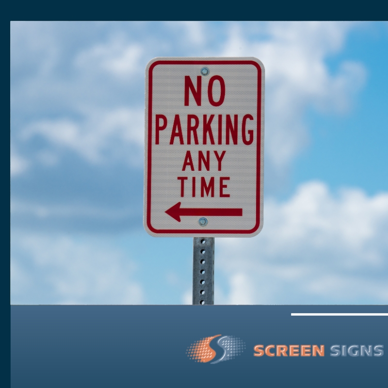
This way finding signage was made out of ALUPANEL – ACM – Aluminium Composite Panel and they were 400w x 600h. All of the sign writing artwork was created by Screen Signs & then printed ready for installation.
These signs weren’t printed to be visible at night time, but that is an option available.
What are the benefits of using wayfinding signage?
When you step into the role of a potential customer – really step into it – then you start to notice things you hadn’t before. Like signage. It seems like such a trivial part of any business, doesn’t it?
Except, it’s anything but trivial.
Imagine this: You’ve got a critical meeting with a new client, and you’re already running a few minutes late. Your heart’s racing as you pull into an unfamiliar office complex. You squint at the buildings, searching for a sign – any sign – to point you in the right direction. But all you’re greeted with is a labyrinth of doors and corridors, no guiding star in sight. Panic sets in. You’re not just late now; you’re embarrassingly late.
That’s what happens when businesses overlook the importance of the right way finding signage: they inadvertently turn their environments into mazes. And nobody likes feeling like a lab rat, especially not your staff or your visitors. That’s why way finding signage isn’t just about signs; it’s about respect.
The right way finding signage is a handshake, a welcome mat, and a first impression all rolled into one. It’s the silent customer service representative that greets your visitors before you do. It says, “Hey, we see you. We’re glad you’re here. Let us help you get where you’re going.” It’s about making people feel seen and considered.
Staff
For your staff, it’s about efficiency and care. It tells them that their time is valuable, that you don’t want them to waste it wandering the halls. It’s about creating an environment where they can do their best work, unhindered by the unnecessary stress of getting lost. It could be simple things like where are the toilets through to important safety warnings for certain areas or dangerous chemicals.
Visitors
And for your visitors, it’s about making every interaction with your business a positive one. Because every touchpoint—every single interaction they have with your business—colours their perception. Make it confusing, and that’s a reflection on your brand. Make it clear, concise, and helpful, and that’s a reflection on your brand, too.
The right way finding signage is a blend of design, psychology, and hospitality. It’s an art and a science. Get it right, and you’re not just installing signs; you’re building trust, respect, and an experience that feels as good as slipping into a pair of old jeans. That’s the kind of stuff that doesn’t just guide people through a space; it guides them right back to you. And that, my friend, is good for business.
What are different types of wayfinding signs?
When it comes to navigating the concrete jungles of commerce, variety isn’t just the spice of life—it’s the secret sauce of savvy way finding. Permanent wayfinding signage is what our sign writing company mainly designs and prints in the Newcastle area. From the moment a visitor arrives at a property, you need to make sure they have clear directions, whether it’s a simple sign directing visitors to reception, or a multiple choice sign mapping out the various sections of your site.
Our signage experts can design and make a range of signs that all work together to move your visitors seamlessly through a building or shop. Here are 15 types of signs to help people find their way and make them feel like you’ve rolled out the red carpet just for them, every step of the way:
- The Welcoming Committee: These are your entrance signs, the ones that say, “Come on in, we’ve been expecting you!” They’re the warm smile of the building, setting the tone for what’s inside.
- The Director: Directional signs are the compass of the corridors, the ones that say, “This way to glory!” (Or, you know, the restroom. Equally important.)
- The Namer: Identification signs, the ones that give a name to a face—or a room. These signs introduce the spaces like they’re characters in a novel you can’t wait to read.
- The Informer: Informational signs, providing the nitty-gritty without making eyes glaze over. Think Wi-Fi instructions that don’t require a Ph.D. to decipher.
- The Order Keeper: Regulatory signs, laying down the law with a velvet glove. They say, “Please don’t smoke,” with the same charisma as a 1940s film star saying, “Darling, let’s dance instead.”
- The Pathfinder: Overhead and hanging signs, ensuring you can find your way without bumping into a soul—because collision-free is the way to be.
- The Storyteller: Historical markers or plaques that offer a narrative, turning a space into a story and a visit into an experience.
- The Style Icon: Branded signs that mesh seamlessly with your aesthetic, whispering, “We’re not just a business; we’re a mood.”
- The Custodian: Safety signs, the unsung heroes that say, “Watch your step,” because they really do care if you slip and fall.
- The Librarian: Directory boards that catalog the contents of a building with the precision of a Dewey Decimal System.
- The Landmark: Monument signs that stand like totems, declaring, “You have arrived,” with a presence that’s impossible to ignore.
- The Whisperer: Way finding maps, because sometimes you need to see the forest, not just the trees, to understand where you’re going. So these are typically in shopping centres, national park walking trails etc.
Each sign is an ambassador, a silent spokesperson for your brand. Crafted with care, they can turn every journey through a space into a subtle conversation between you and your guests, and we all know that the best relationships are built on good communication.
What are the most popular wayfinding signs?
1. Directional Signage
Directional signage is the most common type of wayfinding signage. You can find it in places where travel direction guidance is necessary. Directional signage employs the use of arrows and symbols to offer directional guidance. Some of these signs are globally recognised to create uniformity and standardisation no matter where the person has come from.
Directional signage is also straightforward. For instance, there may be an arrow that depicts the location of a certain facility. The arrow will point right, left, up, down, or forward. Nevertheless, some people don’t interpret directional wayfinding systems with ease.
For the directional signage to provide the required assistance, it must be conspicuous and located in an area where many people can see it. Consequently, you will see many directional signages in elevated positions. The signages will also have a legible font with clear icons or images.
Many directional signages belong to local city municipal authorities. The authorities invest a lot in the design of directional signages. In particular, they focus on the background lighting to ensure that the signage can still be visible at night if it is used on main roads. In other situations it might be to direct people to the toilets, the lifts or emergency stairs.
2. Identification Signage
Identification signage is also very prevalent. Its primary purpose is to indicate the function of a particular installation or individual. For example, a ‘senior manager’ signage can be found at the senior manager’s office entrance. If you don’t know where you are, identification signage can provide additional information. That way, you can determine your next steps.
Creating identification signage requires special skills. The identification signage must provide enough information, but it shouldn’t confuse people. Since excessive details can blur the original meaning, identification signage should be short and accurate.
3. Regulatory Signage
Regulatory wayfinding signs are essential since they display the requirements or regulations for a particular place. For instance, regulatory signage may inform users of a restaurant that smoking is prohibited in that restaurant. Other standard regulatory signage include speed signs and traffic control measures.
The regulatory signs need to be visible to every person. Some regulatory signage includes the penalties for violating the stated requirement. Regulatory signage needs to be short and concise. Moreover, there shouldn’t be more than two regulatory signage in the same place. Generally, the signage will have a picture of what is prohibited and a written explanation.
4. Informational Signage
Informational signage is different from identification signage because it provides extensive information about a specific facility. Informational signage is usually found at the entrance of the facility. Some of its details will include the location and function of various units within that installation.
This provides a general overview of what you can expect to find when you are wandering throughout that facility. Nowadays, informational signage may also include other details such as the Wi-Fi username and password.
5. Emergency Signage
This type of wayfinding signage includes some of the following: First aid kit signs, emergency phone signs, fire extinguisher signs or danger signs to indicate an area that has dangerous chemicals or is unsafe for untrained people etc.
Where can wayfinding signs be installed?
The benefit of working closely with a sign writer is that we can custom design way finding signage to be suitable for installation on practically any surface you can think of. So the most common places that way finding signs are installed will include;
- Walls
- On a pole
- On a gate or fence
- Fascias of buildings
- Glass windows
- Hanging from the ceiling
- On a wall divider
We hope you enjoyed our behind the scenes look at how another business has approached their new signage project. At Screen Signs, we’d be happy to answer any questions you may have and are always happy to come up with some mock up ideas to get things started.

